MuseAR
MY ROLE
Product Designer
TECHNOLOGIES
Figma, Snapchat Lens Studio
TIMELINE
March 2025 – May 2025
Your AR map for the next museum visit.
An ML-powered navigation tool that helps museum visitors find more of what they love — and skip the fatigue of trying to see everything.
CONTEXT
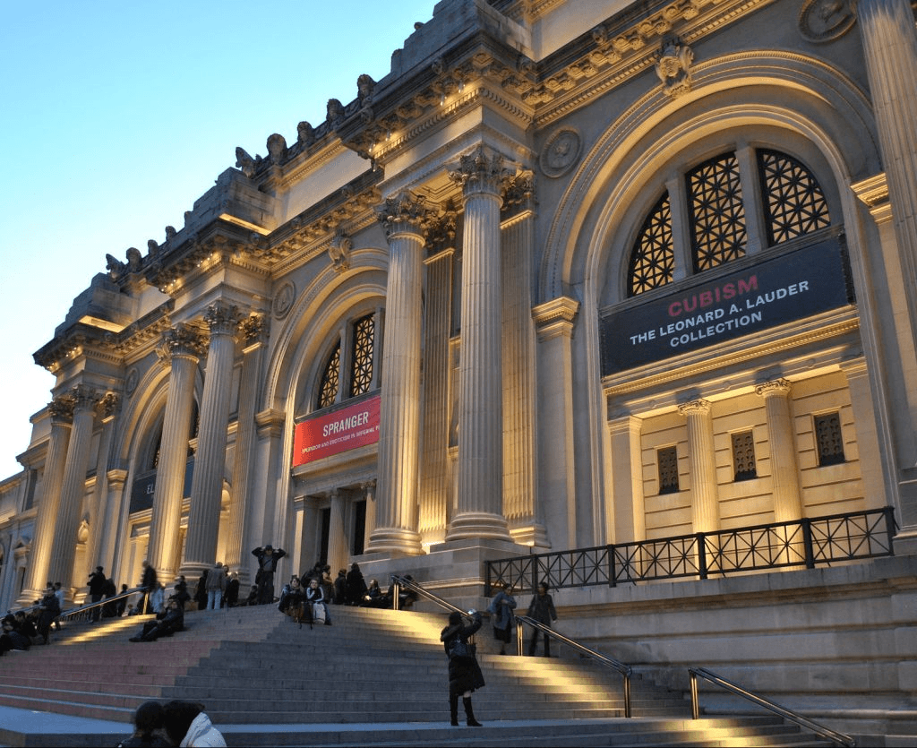
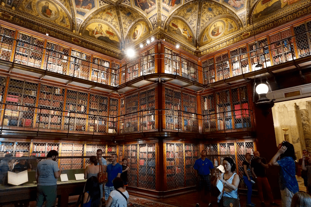
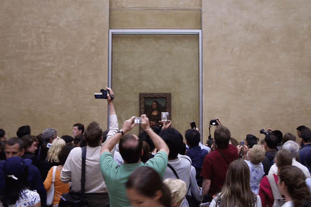
New York City boasts over 170 museums. At major museums like The Met and MoMA, visitors spend just 17 to 27 seconds on average viewing each artwork. Engagement drops significantly after 30–45 minutes, often due to fatigue and lack of direction.
CHALLENGE
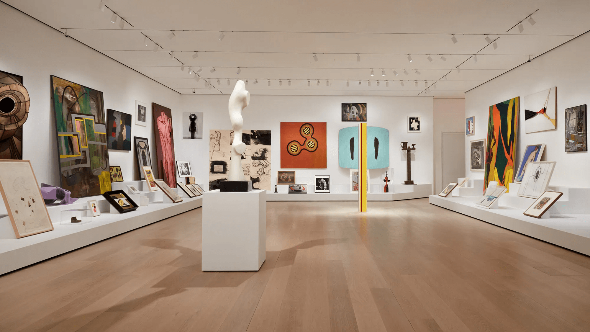
Museums rarely offer navigation that adapts to a visitor's pace, mood, or changing interests. People leave exhausted by the things they didn't care about, having walked past the things they would have loved.
SOLUTION
MuseAR, a location-based ML navigation system that provides personalized recommendations and breaks to make the most of the museum experience — guiding by interest, not by floor plan.
The Landscape
NYC has over 170 museums. At the big ones, visitors spend just 17–27 seconds per artwork, and engagement drops sharply after 30–45 minutes — fatigue and lack of direction. Museums rarely offer navigation that adapts to a visitor's pace, mood, or interests. People leave exhausted by the things they didn't care about, having walked past the things they would have loved.
Understanding Behaviors
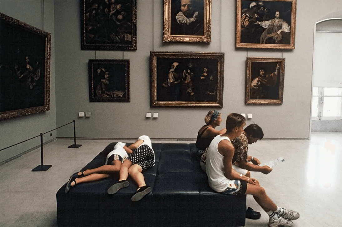
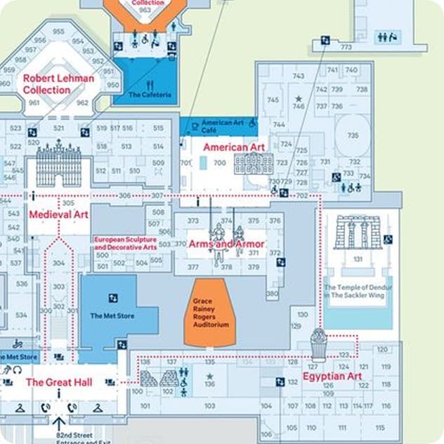
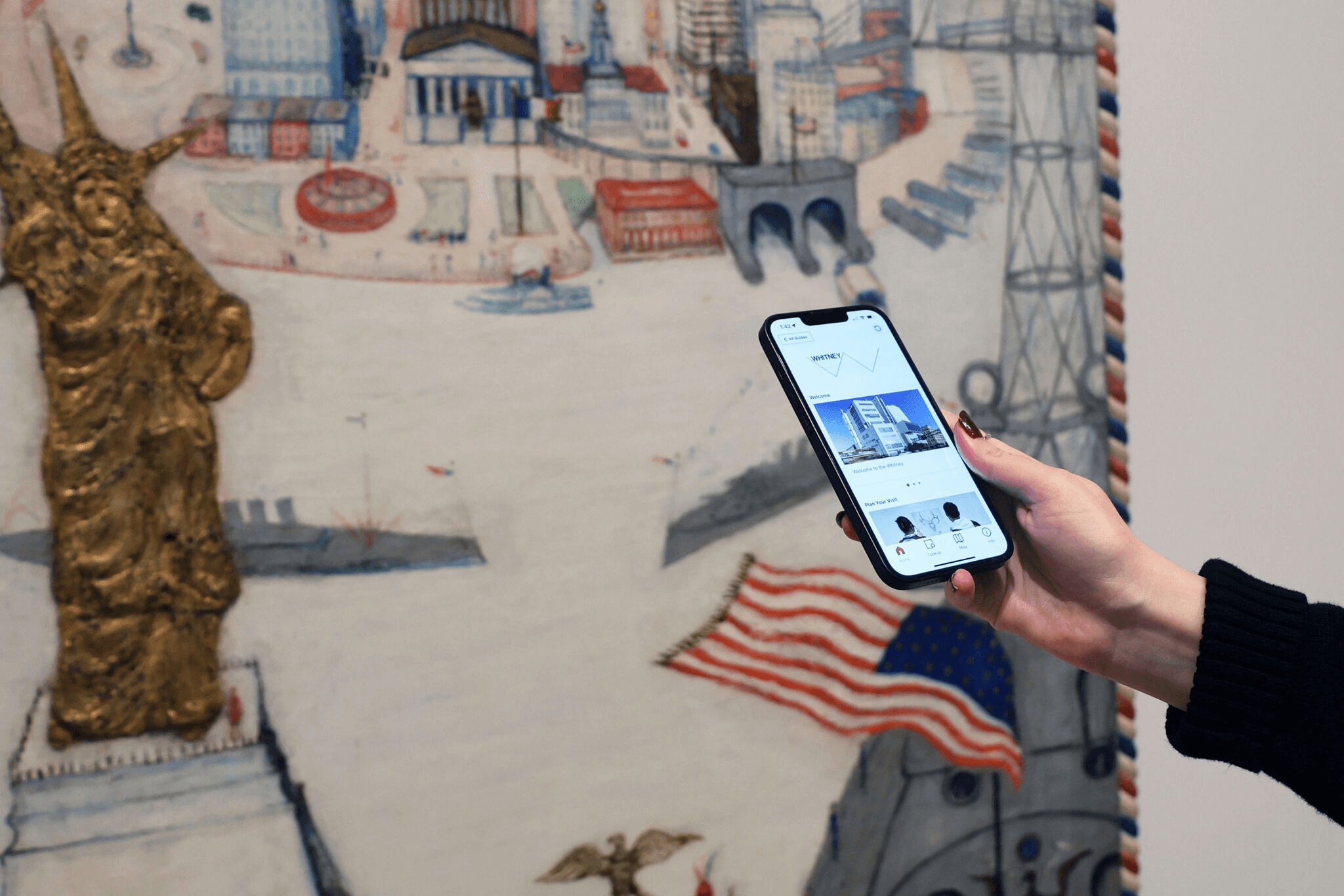
Passive field observations at three major NYC museums — watching how visitors interacted with signage, layout, and their phones. Then five semi-structured interviews about how people plan, navigate, and remember visits. The goal wasn't just to document fatigue — it was to find where in a visit the opportunity to intervene actually sits.
Key Findings
Four patterns shaped everything after. The best experiences came from visitors who arrived with an anchor — one piece they came to see. The worst came from trying to see everything with no filter.
Too many choices, not enough direction
Excessive information and confusing navigation lead to mental exhaustion, reducing engagement and enjoyment. Visitors described feeling “overwhelmed” within the first hour.
The First Bet
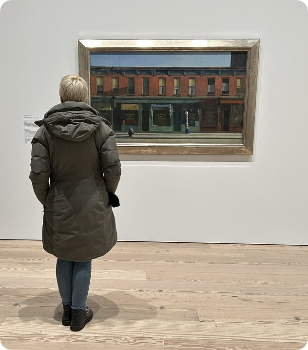
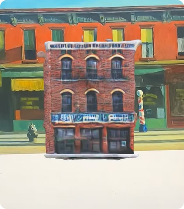
A reasonable bet — given the research.The original problem statement targeted the documentation-vs-presence pattern head-on: visitors move past pieces they love with no way to preserve the connection beyond a quick photo. So the first concept was an AR Gallery — scan an artwork that resonates, collect a 3D model, build a personal digital memory to revisit later.
Original Problem Statement
Museum visitors struggle to maintain meaningful engagement with artworks that resonate with them, often moving past pieces they love without any tangible way to preserve the emotional connection or revisit the experience beyond a quick photo.
The Pivot
It worked. It just solved the wrong problem.Two things broke. Technically, AR tracking was unreliable in crowded, inconsistently-lit galleries across varied phone hardware. But the deeper problem was conceptual: the AR souvenir added a layer of content without changing the pace of the visit. It addressed the experience too late — after the visit — when the real pain was happening during it.
AR tracking proved unreliable
AR tracking was unreliable in crowded museum spaces with inconsistent lighting and varied phone hardware, limiting accessibility and functionality. Custom AR experiences tied to physical locations often failed to trigger accurately.
Redirected Problem Statement
“Museum visitors struggle to preserve the emotional connection… beyond a quick photo.”
→ “How can we help visitors navigate the museum and tailor it to their interests, while curbing museum fatigue?”
The New Solution
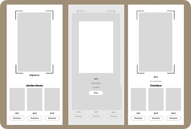
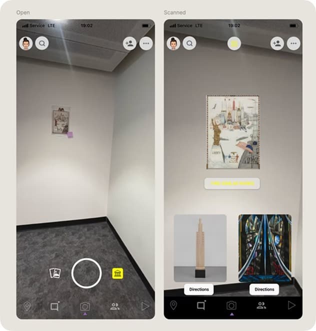
Based on what visitors scan and like, an ML-powered system gives real-time directions to similar or thematically related works nearby — so they discover more of what they enjoy without burning energy deciding.
Minimizes cognitive load
A simple 'like' interaction — no menus, no search, no configuration.
Guides to related pieces
Personalized discovery through thematic connections, not floor order.
Deepens engagement
Visitors linger on work they actually enjoy instead of skimming everything.
Cuts decision fatigue
Smart navigation reduces the mental effort of 'where next?' in a crowded space.
Design
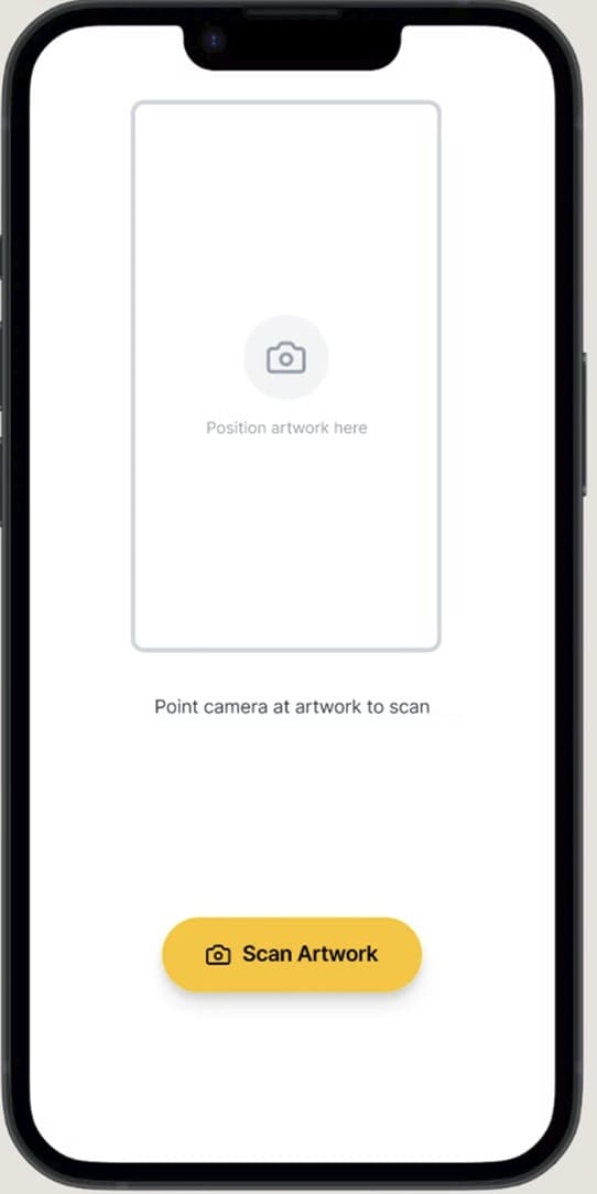
The final interface was deliberately minimal — a “like” button, a direction, and a reason why. No collection screens, no AR overlays, no content layers. The technology receded so the museum experience could stay in focus. The thing that killed the first concept — layering on content without changing the visit's pace — became the explicit design principle of the second.
Impact
In qualitative testing, three things showed up consistently — and they mirror the three opening goals.
Stayed focused on the experience
Participants moved between exhibits with minimal distraction, remaining immersed in the artwork rather than repeatedly stopping to reorient.
Recommendations increased engagement
By surfacing exhibits aligned with visitors' interests, participants spent more time engaging with artworks they genuinely enjoyed instead of skimming.
Reduced cognitive load
Navigating large, crowded museum spaces can be mentally taxing. The guidance system reduced the effort required to decide where to go next.
Reflection
Issues with AR development
Location-anchored AR often fails to trigger reliably. I scoped Lens Studio down to minimal interaction testing and carried the rest in a Figma prototype — a constraint I'd plan around from the start next time.
Understanding when to pivot
The post-visit memory tool made sense on paper, but real testing showed it answered a need nobody had yet. Learning when to pivot — to stop defending the idea and move to the moment help was actually needed — was the real outcome of this project.