
Punch Wallet
B2B brand identity · Design systems · Vibe coding
Punch Wallet
MY ROLE
Product Designer
TEAM
Asma Rathod, Ruoling Xu, and Jasmine
TECHNOLOGIES
Adobe Illustrator, Figma, Claude Code
B2B BRAND SYSTEM
Punch cards, reinvented for the people behind the counter
CONTEXT
PunchWallet is a web-based loyalty platform built for independent food vendors and food trucks: a cheaper, lower-complexity alternative to enterprise loyalty systems like Toast and Five Star.
CHALLENGE
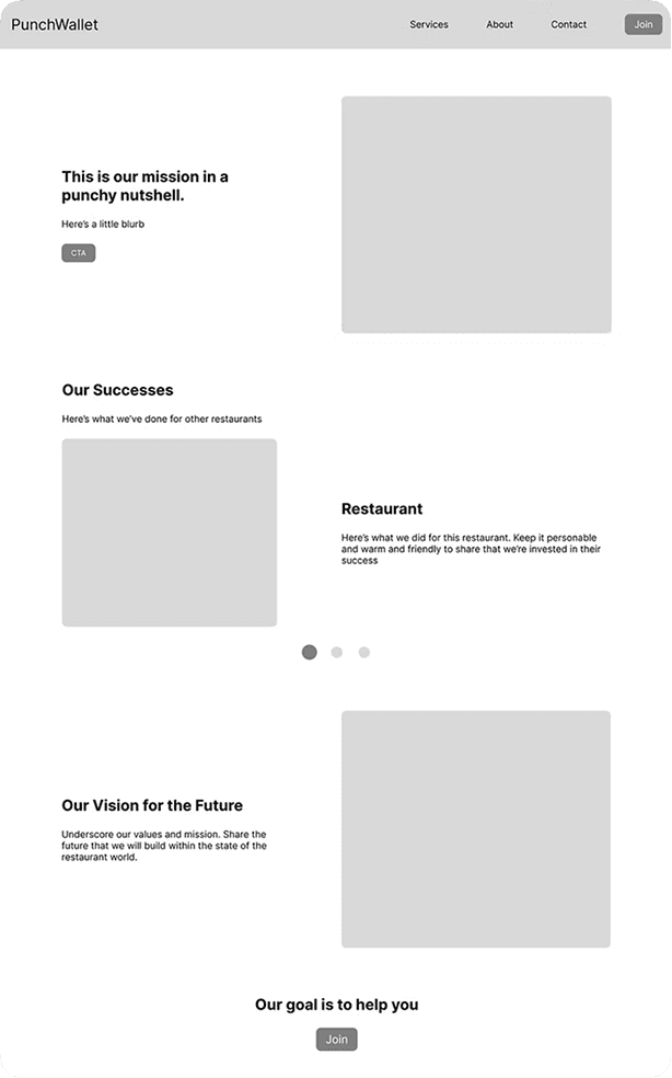
The existing brand was visually forgettable and strategically misaligned. A QR code stood in for a logo, and the homepage spoke to diners when the entire growth model depended on vendor acquisition.
SOLUTION
A complete brand system and B2B-focused site that leads with vendor value, separates the vendor sign-up path, and answers one question on every page: is this a partner I can trust with my customers?
The Landscape
PunchWallet is a web-based loyalty platform built for independent food vendors at a lower cost and complexity than enterprise alternatives. Despite a strong product, the existing brand was visually forgettable and strategically misaligned, built around a consumer-facing aesthetic that reflected what happens when tools do the thinking.
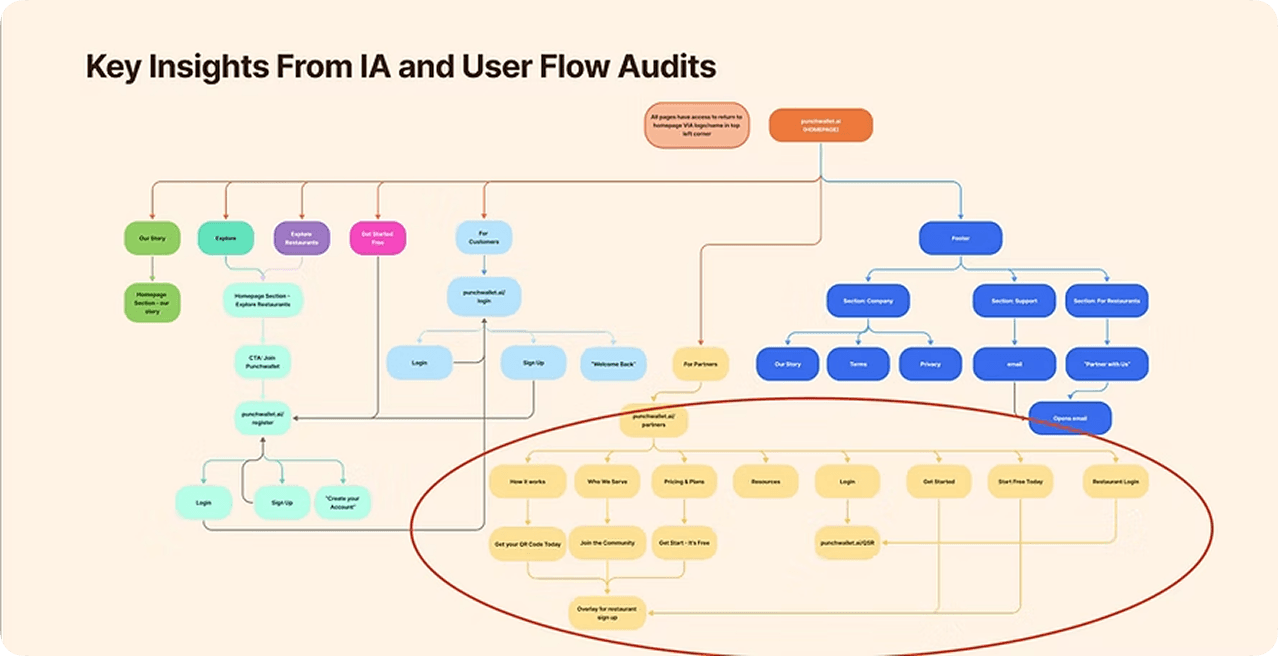
Understanding behaviors
Before designing anything, we ran a brand audit and an IA audit to measure the gap between what PunchWallet was and what it looked like. The client brief was clear about personality: "feels like home," warm, nostalgic, honest, "no B.S.", but none of that was showing up on the page. We benchmarked against Toast and Five Star across three markers that build vendor credibility: visual consistency, benefit-driven copy, and product proof. PunchWallet had none of the three.
Key findings
The audit surfaced three interconnected problems. The brief described a brand that was friendly, supportive, and "short and sweet," one that wouldn't waste a restaurant owner's time. But the site was doing exactly that: burying vendor value behind consumer-facing messaging, offering no visual proof of legitimacy, and making sign-up a guessing game.
Legitimacy Gap
Visually unable to compete with fellow competitors and risks being perceived as an "amateur project" rather than a robust business tool.
User Friction
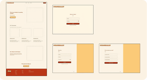
B2B and B2C flows are tangled with no clear hierarchy, causing drop-off at the critical vendor sign-up moment.
Copy Imbalance
Copy has the right instincts but lacks visual support: the style and supplementary assets needed to make it land.
Solution
Build a brand system and B2B site that could earn a vendor's trust on first impression, expressing approachability without sacrificing the credibility a vendor audience demands.
Problem Statement
How do you translate a startup's values into a brand that B2B vendors actually trust?
The shift
The reorientation wasn't just visual, it was structural. The site needed to speak to vendors first and diners second, which meant untangling the two audiences entirely: distinct paths, distinct messaging, distinct hierarchy. But the brand shift was equally important. The brief asked for something that "feels like home" and is "almost appetizing in design," a personality you'd never get from a standard B2B playbook of gray backgrounds and stock photography. The question became: how do you build warmth a vendor trusts?
Design
The brand system needed to hold two things in tension: the warmth and nostalgia that made PunchWallet feel human, and the visual consistency that made it feel professional. The instinct in B2B is to default to clean and corporate. We went the other direction, building a distinct visual personality with intention and restraint, designed to differentiate PunchWallet from enterprise competitors rather than imitate them.
Logo
The QR code had to go. It said "tech tool," not "partner for your business." The new wordmark needed to carry the brand's warmth without sacrificing legibility or professionalism. The goal was a mark that could sit on a restaurant counter and feel like it belonged, not a logo that screamed startup.
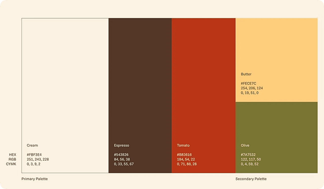
Color Palette
The brief described a brand that was "warm, nostalgic, and almost appetizing." That ruled out the cold blues and purples of the existing site immediately. The palette needed to evoke the feeling of a neighborhood restaurant: familiar, inviting, a little bit retro, while staying clean enough to read as a serious business tool. Warm tones for personality. Restrained application for trust.
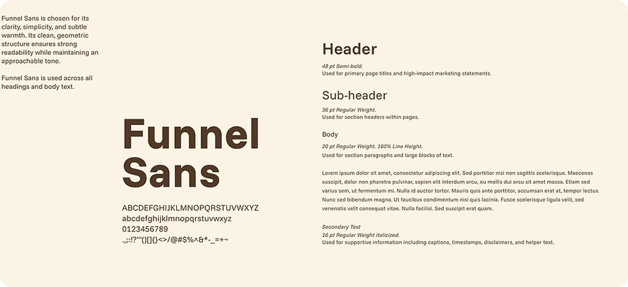
Typography
The type system carried the same tension. The brief asked for "short and sweet" and "no B.S.", a tone that doesn't waste a restaurant owner's time. That meant a typeface with enough personality to feel distinct from enterprise competitors, but enough clarity to scan quickly on a phone screen between lunch rushes: clean hierarchy, generous sizing, no decorative excess. Funnel Sans was chosen to balance clarity with subtle character, supporting fast scanning and strong legibility across the product.
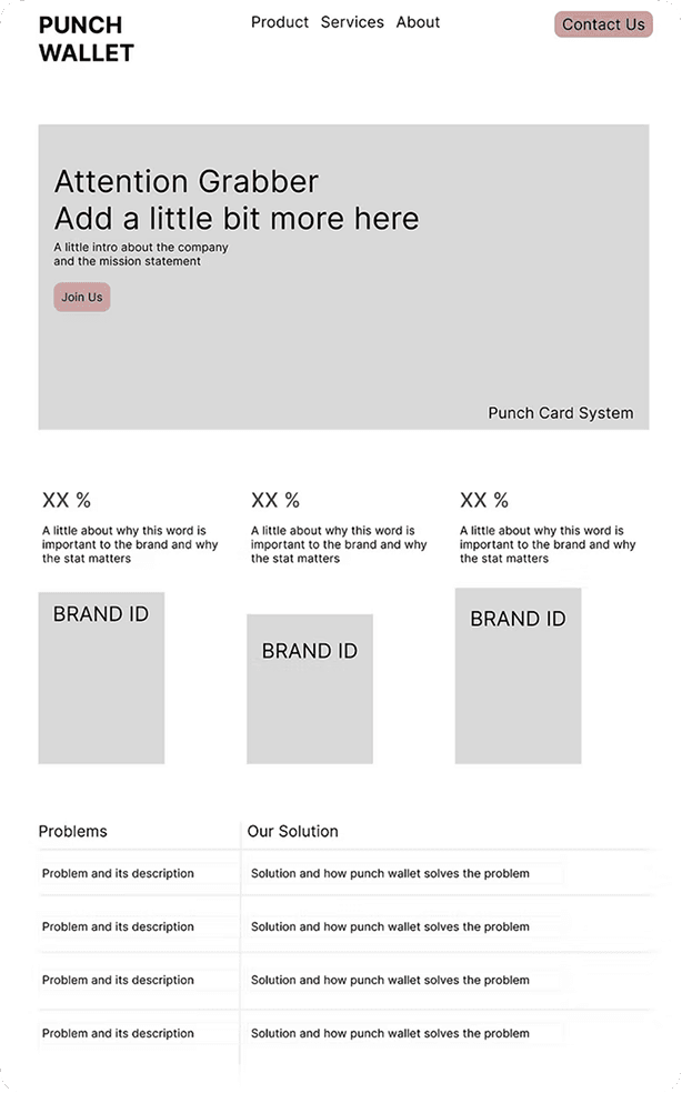
Site Design
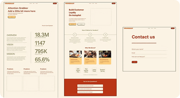
With the brand system in place, the site could finally do what it was supposed to: make the case to vendors. The homepage led with vendor value, not diner features. The sign-up path was separated and prioritized. Every page was built to answer the vendor's core question: "Is this a partner I can trust with my customers?"
Shipping with Claude Code
AI-assisted development let us iterate on implementation in real time: refining spacing, adjusting responsive behavior, and testing component variations without the delays of a traditional design-to-development handoff. The key was that the design system, hierarchy, and interaction decisions were already resolved before any code was generated. AI accelerated execution; it didn't replace the design process.
Why AI?
We used AI where it added the most value: translating a resolved design system into production-ready code, scaffolding components, applying design tokens consistently, and handling rapid implementation refinements, execution tasks where the decisions were already made.
The bigger value was learning where in the workflow AI speeds things up. Understanding how to prompt it well builds a muscle for automating the tedious parts of the process, like quick fixes in the codebase, so more time goes toward higher-level design decisions.
Impact
The deliverable was a complete brand system and B2B-focused site, handed off via Figma prototype and GitHub. But the real impact was the reframing. By diagnosing the B2C-versus-B2B misalignment before touching any visuals, every design choice had a clear brief to answer to. The brand went from something a vendor would scroll past to something that looked like what the brief always described: "the kind of partner I want attached to my business."
Reflection
Brand strategy is vendor acquisition strategy
A brand audit is only useful if it's read against the business objective, not just the aesthetic. On this project, identifying the B2C versus B2B misalignment before touching any design decisions meant every subsequent choice had a clear brief to answer to.
Approachability and credibility can coexist
The instinct in B2B is to default to clean and corporate. This project showed that a distinct visual personality, when built with intention and restraint, can be the thing that differentiates a smaller platform from an enterprise competitor rather than undermining it.
AI requires a designer in the driver's seat
The existing site reflected what happens when output replaces thinking. Using AI with direction, as one part of a considered design process, produces something a vendor can trust. Without that intention, it produces something forgettable.
IA decisions are brand decisions
Restructuring the site's information architecture to separate vendor and customer paths was not a UX fix in isolation. It was a signal to vendors that PunchWallet understood their needs specifically, the first thing a B2B brand has to communicate before anything visual does.